I’ve wanted to do this for some time but am not sure if this would be a long running thing. Basically, since my first visit I have been thinking about different ways to connect visual cultures in Hong Kong and in Japan. On top of my more theoretical series, I would like to do a series of posts where I would experiment with certain visual elements of the aspects relating to the art project.
To start us off I would like to recall the title of the art project—半步屋.
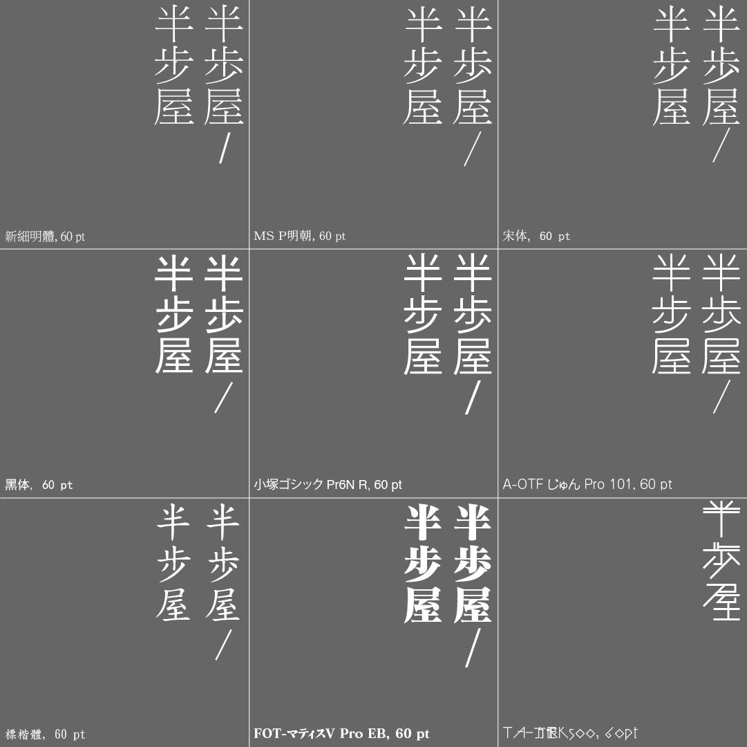
Quite early on Tung Pang has mentioned that the name is indeed readable in both Chinese/Cantonese (‘bàn bu wū’/’bun3 bo6 uk1’), as well as in Japanese (which I’d imagine it to be something along the lines of ‘han po ya’). And then I thought, what if this duality could be represented visually?

And there we go, a cacophony of different fonts, some Chinese, some Japanese, some familiar, some less so. Note that apart from the bottom right square, every one of these squares contain both a Chinese and Japanese version of the word ‘步.’ ‘步’ is Chinese writing, while ‘歩’ is Japanese. Even though the differences are noticeable, they are probably not enough to barricade someone who only speaks Chinese or Japanese from understanding it.
The first row consists of a category of typefaces commonly known as Ming or Sung in Chinese, or Mincho in Japanese. The term comes from the font’s resemblance to typefaces that date back to as early as the Song Dynasty, or perhaps the Ming Dynasty. These would be equivalent to the serifs of Latin-based fonts—you can see the little tails sticking out of some of the strokes. One row below, we see the sans serif equivalent of these East-Asian fonts, called Heiti in Chinese, or Gothic in Japanese, and the strokes become smoothed out. Whilst Mincho fonts are common in printed material and text bodies for its classic print look, Gothic fonts are widely used in signage and advertisements for its relatively legibility and simplicity. That said, both types of fonts have seen extensive use in many areas, and more often than not fonts are specifically chosen on a case-by-case basis.
One observation I made while making this diagram is how visually similar and interchangeable these fonts can potentially be, especially at a glance. Trained eyes, however, would beg to differ, but I digress.

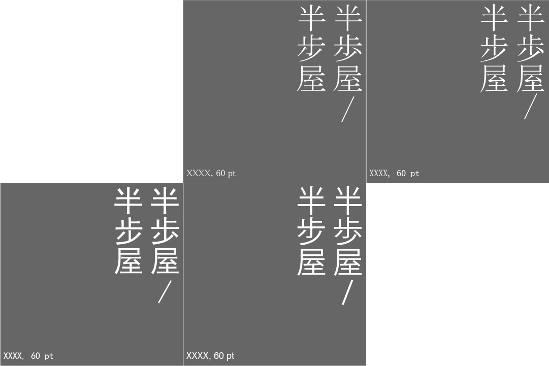
The only visible difference here is a single difference between connecting or disconnecting a stroke in the ‘至’ component of the work ‘屋’. This speaks to the similarities that Hong Kong people might share with Japanese people when it comes to visually experiencing words.
The third row are the wildcards. You might remember Matisse EB from Evangelion, but I threw some decidedly stylised fonts into the mix. With the third row, we see culture forming a large portion of the typefaces’ identities, whether it is Chinese calligraphy, or Japanese anime, or whatever ‘TA-方眼K500’ is trying to do.
We all know that fonts play a big role in our perception of the words—rounded fonts can be friendlier than jagged fonts, and Comic Sans means you don’t have to take it seriously (just kidding). So here are the questions that arise from my little experiment:
- Is it that important to distinguish between Japanese and Chinese characters?
- Is it inherently wrong to use a Japanese font for a Chinese character, and vice versa?
- Does mixing fonts together in the same space create any tension, either visually, or culturally?
- And last but not least, how would a Chinese viewer read these differently from a Japanese viewer?


Find us on…