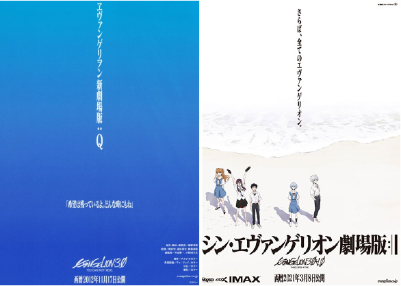
Take a look at these images.

(Fig.1—Left: EVA movie poster from 2012; Right: Movie poster of the series’ newest instalment.)
These posters are released 8 years apart, yet they look like they could well have been done on the same day. At one glance, the words, being placed at the centre, pop out and catch the reader’s attention, while illustrations take the backseat in relaying information about the poster, even though this is an anime film. This is the universality of typography in Neon Genesis Evangelion, if not in the broader context of popular visual culture.
Wait, Anime?
Frankly speaking, I intended to write about this later on, but since the final movie instalment of the Neon Genesis Evangelion franchise started screening at the time of my writing this, I figured this would be a good time. In this first blogpost, I will try attempt to identify typography as an intersecting point of visual culture between HK and Japan by looking at a piece of animation work that has sent ripples through not only the anime industry, but also wider popular culture.
As I said in my last post, I am indeed more into Japanese culture than I’d care to admit.
A Truncated Introduction of EVA
For those who might not have heard of it, Neon Genesis Evangelion, which first aired in 1995, is a TV anime that follows a schoolboy called Ikari Shinji as he pilots robots and fight against aliens, also known as ‘angels.’ The series is a classic of Japanese anime known for practically redefining and reinventing storytelling in its medium, unapologetically utilising techniques and cuts that would be considered avant-garde even 20 plus years after its first airing, all in the guise of a ‘mecha’ anime that lent its concept from popular shows such as Mobile Suit Gundam. Without spoiling anything, I would say that nothing is as it seems in this anime. Absolutely nothing.
Of course, this is excluding its typeface. In fact, I was very much infatuated with the title cards of EVA, even before actually watching it. Its iconic condensed and heavy Mincho-esque font is recognisable from afar. Even the t-shirt designs in EVA’s collaboration with UNIQLO made use of the typeface to encapsulate that loud, foreboding aesthetic.

(Fig. 2—An example of a UNIQLO UT Graphic T-Shirt with a type-based design.)
マティス EB (Matisse EB) and Visual Identity
Matisse EB, which is within the Matisse font family, is licensed by Fontworks, a Japan-based typeface design and licensing company. The font was handpicked by director Anno, who, according to Peiran Tan in his article on fonts in EVA, decided to depart from the trend of using sans serifs or hand-drawn sans serif mimics and for stronger visual impact3. Bold, yet slightly subdued, Matisse EB would go on to visually symbolise the anime, manifesting an identity of its own. While it is difficult to say if EVA ushered in a new convention of type-based anime visual identities, I think it would be fair to acknowledge a formal resemblance between EVA and subsequently released shows that rely on typography as a stylistic cue, whether artistic or commercial (see fig. 2).

(Fig. 3—Left: Episode Title card of EVA, 1995; Right: A scene transition in the Monogatari Series Anime, 2009.)
I will not delve into the specifics of font usage in EVA, but Peiran Tan from Fonts In Use gives a rather comprehensive dive into each and every Evangelion font, and even the minute variations between fonts in newer and older versions of the anime.
What does all this have to do with intersecting cultures?
Well, let’s just say in the next post in this series we will be jumping a lot between Japan and Hong Kong.
Till then!
References
‘Black Scene.’ Anime & Manga, Stack Exchange. Stack Exchange, October, 2014. Last accessed April 4, 2021. https://anime.stackexchange.com/questions/5325/what-do-the-black-and-red-scenes-mean.
©khara. ‘Celebrating the release of the latest Evangelion movie! Special collection featuring exclusive artworks.’ Uniqlo UT Official Website. 2020. Last accessed April 4, 2021. https://www.uniqlo.com/us/en/ut-graphic-tees/evangelion.
Nishigori, Atsushi. ‘『シン・エヴァンゲリオン劇場版』本予告、劇場用ポスター公開.’ evangelion.co.jp. December 2020. Last accessed April 4, 2021. https://www.evangelion.co.jp/news/shin1225/.
Samepa. ‘「希望は残っているよ。どんな時にもね」.’Hatena Blog. July 2012. https://samepa.hatenablog.com/entry/20120714/1342236494.
Tan, Peiran. ‘Neon Genesis Evangelion: Graphic designer Peiran Tan plumbs the typographic psyche of the celebrated anime franchise.’ Fonts in Use. Fonts in Use, October 17th, 2019. Last accessed April 4, 2021. https://fontsinuse.com/uses/28760/neon-genesis-evangelion.


Find us on…